
This week I'm venturing out of my skincare comfort zone and into unfamiliar territory and doing a first look and swatch breakdown of the just-barely-released Clio Pro Palette, which I purchased from Clio's official US shop, Club Clio USA. In fact, I don't think this palette is available online yet, just in their NYC store, but I figured it would be helpful to have some real-life swatches available for reference for those eyeing it.
So how did I get it when it's not released online yet? Happy accident- I didn't even realize it was not generally available yet; I was emailing back and forth with Clio to arrange for delivery of my replacement Tension Lip in 'Some' from this summer haul. My original tube melted in summer heat, and they offered to replace it immediately, but I asked them to wait until the weather cooled and then just toss it in with the next order I made.
It's now autumn, I was prepping for an upcoming Instagram giveaway, and I wanted to purchase a few things to test while they were having their 10 Days of K-Beauty discount. (Enabling mode: engaged and ready for action.) I asked what sort of fall-themed makeup they recommended, since I was getting some autumnal lip shades. They mentioned that they had the new Pro Palette and sent me a product/swatch photo, and I caved like wet cardboard. Fall-themed colours are my weakness, and my point makeup wardrobe is scant.
Before we get into the swatches and my impressions, I need to set some expectations here: I suck at point makeup. Put me at a table with 30+ products and ask me to put them in order of application, and like a film assassin dissembling a gun, I will have that lineup arranged before you finish wiping off your makeup. Judging the powers of pigmentation payoff? Snesus take the wheel.
However, what I can do is provide my thoughts on how a makeup derp like myself would fare with this palette, and frankly most Korean makeup is skewed towards minimalism, natural looks, or subtle accents. Naturally flawless skin is a feature as important as your eyes. This means that a lot of people (like me) have gotten into makeup due to the lessened pressure of the Korean style- I feel a lot more comfortable rocking a vivid plum in a gradient lip than the western trend of a full coverage, bold, defined lip.
In this post:
The palette is nestled in a metal tin, which gives it a pleasant sturdiness. As you can see in the first image in this post, tt contains an inner liner to protect the shadows and also label them; they are also labelled on the back of the tin. The back also contains both Korean and English text, which is a nice perk.
The lid contains a mirror protected by a liner which is easily peeled away by the tab attached to one corner, which you can see in the next photo. Anyone who has struggled to peel up the edge of a mirror liner can instantly appreciate that little touch.
The Applicator
It also comes with a standard double-ended makeup applicator: one end is a flattened dome (? I am not even sure if this is the right term, please forgive me) bristle brush and the other is a foam tip.
To my surprise, it did not feel cheap and I did not hate it- I do have some Real Techniques brushes that I would normally use for my flailing attempts to apply makeup, but if I was (let's just say hypothetically) at my in-laws for the weekend and stuck with just that applicator, I'd be fine. Not that such a thing happened, or that I am writing this blog post on my laptop in the car on the way back, or anything like that. Nope. Hahahaha. *nervous laughter and shifty eyes*
The Shadows in Action
Since it's what I had on hand, I set out to see if I could use the included applicator to create an eye look- how would they blend? Would their shades turn muddy? Would the shiny shades be wearable, or would they turn glittery? (Not something my 30+ self is looking for) So I went to town with what I had, and this was the result, on the back of my hand:
I can only conclude that maybe I should not have had that second cup of coffee with pumpkin spice creamer?
I would have attempted an actual look on my own eye, but I am pretty sure that my Urban Decay Primer Potion is 3 years old and there's no way I'm letting it anywhere near my actual eyeball.
With the black pencil from my Beauty People Snow White set for the basic shape, I used the palette shadows to 'paint' the eye on the back of my hand. It ... sort of worked? Maybe?
I managed to use every shade other than the ultra-glittery Gold Carat, and ended up with something that I feel I could actually wear. That's encouraging- I feel like all these shades really work well together.
Pigmentation & Ease of Use
The shadows were quite soft and it was easy to pick up product, and overall they were very easy to use. I found that fingers or the foam tip applied the duochromes better, because it allowed me to pat on the shadow instead of brushing it on. They blended easily and I suspect that they are not pigmented enough for western tastes, but for someone like me who is '50 shades of flail' with makeup, it's a good middle ground between “so sheer I can't tell if it's applied” and “oh god what have I done?!” I can see myself using all but one of the shades, and that's pretty decent for a non-custom palette, and the shade I was the most nervous about is actually my favourite out of the lot.
Let's jump into the swatches!
The Swatches
The palette comes with 8 shades; two mattes, two shimmers, two duochromes, a semi-shimmer, and an outright glitter. I will also say that swatching is a learned skill that requires practice, and preferably a non-overcast day. I have not edited this photo other than very minimal colour correction; the red in the background pink-washed everything- I have not even adjusted brightness or contrast. That may be excessively cautious, but I'd rather under-edit than over-edit.
I have done these swatches to be half with primer, half without; the top half of these is over Urban Decay Primer Potion, the bottom half is on bare, clean skin.
From wrist to elbow:
My Top Picks
I'm not including the black and (off-) white basic shades because they're functional, useful, and pretty standard. These are the ones that I see myself using as actual 'point makeup' and the ones I will reach for the most when I'm attempting to do an “eye look” instead of my usual “apply mascara + a strong lip “ safety zone. You can see how pigmented these are when picked up on my fingertips.
From left/index finger:
The duochrome shift of Holly Burgundy and Queen's Pink is challenging to pick up on camera, but it's still fairly subtle as far as duochromes go- K-Beauty is so much more light-handed with point makeup that you're not going to see the hardcore shift that you'd find in say, MAC.
Initial Thoughts
As someone with genetically hooded eyes that have only worsened with age, I'm determined to perfect the art of the 'vertical gradient' which is normally associated with mono- or heavy-lidded Asian eyes, but is also recommended for hooded eyes like mine. These shades seem like they might be deliberately designed to work together to create vertical gradients, since they are so popular on Asian beauty shows, but that's all the better for me. (It reminds me of the 'everything goes with everything else” approach that my pragmatic and non-fashion-conscious husband takes with his wardrobe. Smart man.)
I'm pretty pleased that I could (and did) throw this into my bag as I head off for a weekend trip and have plenty of options to work with. I would have loved to have another matte in lieu of the glitter shade, and I find the combination of Queen's Pink, Beige Shine, and Modern Brown to be “a lot of similar light beige-y shimmery shades”, and would have preferred a plummy purple or a purple/gold duochrome. That's the problem with palettes in general- you won't always love or need every single shade.
For that reason, I am not sure this would be a must-have for someone who already has a serious makeup collection, because there's nothing groundbreaking or unique in the lineup. That being said, as someone who has a grand total of two shadows that aren't So Old You're Asking For An Eye Infection, and one of which is both highly pigmented and very unblendable, I now have 7 shadows that I can see myself regularly using. A 7 out of 8 score is great; I'm happy with my purchase.
The palette retails at $40 but Clio was running a discount event when I purchased mine- if/when it becomes available online I'll update this post with a link and price. As K-Beauty goes, I think Clio's bid to be a legitimate entry into decently performing point makeup is a solid one.
All the best,
 |
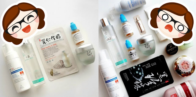
| Clio, Peripera, and Goodal sample swag. |
It's now autumn, I was prepping for an upcoming Instagram giveaway, and I wanted to purchase a few things to test while they were having their 10 Days of K-Beauty discount. (Enabling mode: engaged and ready for action.) I asked what sort of fall-themed makeup they recommended, since I was getting some autumnal lip shades. They mentioned that they had the new Pro Palette and sent me a product/swatch photo, and I caved like wet cardboard. Fall-themed colours are my weakness, and my point makeup wardrobe is scant.
 |
| It's the most wonderful time of the year (for me.) Leaves courtesy of my non-judgemental in-laws' backyard. |
However, what I can do is provide my thoughts on how a makeup derp like myself would fare with this palette, and frankly most Korean makeup is skewed towards minimalism, natural looks, or subtle accents. Naturally flawless skin is a feature as important as your eyes. This means that a lot of people (like me) have gotten into makeup due to the lessened pressure of the Korean style- I feel a lot more comfortable rocking a vivid plum in a gradient lip than the western trend of a full coverage, bold, defined lip.
In this post:
- The Packaging
- The Applicator
- The Shadows in Action (sorta)
- Pigmentation & Ease of Use
- The Swatches
- My Top Picks
- Initial Thoughts
Just a quick reminder that this is not a full review; I will need to fully test this palette so I can comment on wear time, lasting power, fallout, etc, the purpose of this "first look" is just that- first impressions and swatches of everything. I've done them with and without primer, and tested what they look like blended together, but I'm still new to this whole ... makeup business. Ah well, practice makes perfect. Onward!
The PackagingThe palette is nestled in a metal tin, which gives it a pleasant sturdiness. As you can see in the first image in this post, tt contains an inner liner to protect the shadows and also label them; they are also labelled on the back of the tin. The back also contains both Korean and English text, which is a nice perk.
 |
| According to the back: mattes = deep makeup, shimmers = daily makeup, glitters = party makeup. |
The Applicator
It also comes with a standard double-ended makeup applicator: one end is a flattened dome (? I am not even sure if this is the right term, please forgive me) bristle brush and the other is a foam tip.
 |
| Freshly out of the box, without my fingerprints all over it ... yet. |
The Shadows in Action
Since it's what I had on hand, I set out to see if I could use the included applicator to create an eye look- how would they blend? Would their shades turn muddy? Would the shiny shades be wearable, or would they turn glittery? (Not something my 30+ self is looking for) So I went to town with what I had, and this was the result, on the back of my hand:
 |
| Er. This happened. |
I would have attempted an actual look on my own eye, but I am pretty sure that my Urban Decay Primer Potion is 3 years old and there's no way I'm letting it anywhere near my actual eyeball.
With the black pencil from my Beauty People Snow White set for the basic shape, I used the palette shadows to 'paint' the eye on the back of my hand. It ... sort of worked? Maybe?
I managed to use every shade other than the ultra-glittery Gold Carat, and ended up with something that I feel I could actually wear. That's encouraging- I feel like all these shades really work well together.
Pigmentation & Ease of Use
The shadows were quite soft and it was easy to pick up product, and overall they were very easy to use. I found that fingers or the foam tip applied the duochromes better, because it allowed me to pat on the shadow instead of brushing it on. They blended easily and I suspect that they are not pigmented enough for western tastes, but for someone like me who is '50 shades of flail' with makeup, it's a good middle ground between “so sheer I can't tell if it's applied” and “oh god what have I done?!” I can see myself using all but one of the shades, and that's pretty decent for a non-custom palette, and the shade I was the most nervous about is actually my favourite out of the lot.
Let's jump into the swatches!
The Swatches
The palette comes with 8 shades; two mattes, two shimmers, two duochromes, a semi-shimmer, and an outright glitter. I will also say that swatching is a learned skill that requires practice, and preferably a non-overcast day. I have not edited this photo other than very minimal colour correction; the red in the background pink-washed everything- I have not even adjusted brightness or contrast. That may be excessively cautious, but I'd rather under-edit than over-edit.
I have done these swatches to be half with primer, half without; the top half of these is over Urban Decay Primer Potion, the bottom half is on bare, clean skin.
 |
| Click for large size! |
- Matte Black – a soft, pigmented, matte black that will be perfect for shadow-as-liner, for patting on top of liquid or gel or pencil liner to set, intensify, or blend the edges of the liner. It's not as pigmented as the Urban Decay Perversion matte black that I have, but it's a lot less intimidating to use.
- Mocha Brown – a medium/deep brown with a very subtle shimmer particles in it, so very wearable, nicely pigmented, and one of my picks from this set.
- Gold Carat – a hot mess of glitter. It stuck well to the primer, so it could be usable if you are into glitters, but it almost immediately rubbed off on the bare skin half. This is the one shade that's a hard pass for me, but I don't do glitters so ymmv.
- Holly Burgundy – a duochrome of faintly plummy pink/copper, with hints of bronze, rose, and peach. To my surprise, this is my top pick from this set; the duochrome shift is noticeable but still wearable, and is just such a pretty shade. It's pigmented, soft, and easy to blend out into a subtle watercolour wash of colour.
- Modern Brown – a shimmery light brown, very wearable.
- Beige Shine – a warm beige shimmer, also very wearable. Although it looks a bit pink in this swatch, it's more of a classic light golden beige and works perfectly as an inner corner highlight or aegyo sal highlight. This is also one of my picks from this set.
- Queen's Pink – a duochrome, so it looks gold here but that's because it's colour shifting; it's actually a light pink/gold duochrome and it's very pretty. This is one of my picks for the set, and something I'd wear on the inner lid/as an all over highlight
- Cotton Primer – a matte highlight that is pigmented yet blendable, and very smooth to use. It's not much lighter than my natural skin tone, so I anticipate using this a lot as an all-over brightener, a brow highlight if I don't want a shimmer, a good base shade, and for days when I want something subtle pair with a strong liner.
My Top Picks
I'm not including the black and (off-) white basic shades because they're functional, useful, and pretty standard. These are the ones that I see myself using as actual 'point makeup' and the ones I will reach for the most when I'm attempting to do an “eye look” instead of my usual “apply mascara + a strong lip “ safety zone. You can see how pigmented these are when picked up on my fingertips.
 |
| These are 'stick finger in pan and wiggle, not repeated swipes', so quite pigmented! |
- Mocha Brown
- Holly Burgundy
- Beige Shine
- Queen's Pink
The duochrome shift of Holly Burgundy and Queen's Pink is challenging to pick up on camera, but it's still fairly subtle as far as duochromes go- K-Beauty is so much more light-handed with point makeup that you're not going to see the hardcore shift that you'd find in say, MAC.
Initial Thoughts
As someone with genetically hooded eyes that have only worsened with age, I'm determined to perfect the art of the 'vertical gradient' which is normally associated with mono- or heavy-lidded Asian eyes, but is also recommended for hooded eyes like mine. These shades seem like they might be deliberately designed to work together to create vertical gradients, since they are so popular on Asian beauty shows, but that's all the better for me. (It reminds me of the 'everything goes with everything else” approach that my pragmatic and non-fashion-conscious husband takes with his wardrobe. Smart man.)
I'm pretty pleased that I could (and did) throw this into my bag as I head off for a weekend trip and have plenty of options to work with. I would have loved to have another matte in lieu of the glitter shade, and I find the combination of Queen's Pink, Beige Shine, and Modern Brown to be “a lot of similar light beige-y shimmery shades”, and would have preferred a plummy purple or a purple/gold duochrome. That's the problem with palettes in general- you won't always love or need every single shade.
For that reason, I am not sure this would be a must-have for someone who already has a serious makeup collection, because there's nothing groundbreaking or unique in the lineup. That being said, as someone who has a grand total of two shadows that aren't So Old You're Asking For An Eye Infection, and one of which is both highly pigmented and very unblendable, I now have 7 shadows that I can see myself regularly using. A 7 out of 8 score is great; I'm happy with my purchase.
The palette retails at $40 but Clio was running a discount event when I purchased mine- if/when it becomes available online I'll update this post with a link and price. As K-Beauty goes, I think Clio's bid to be a legitimate entry into decently performing point makeup is a solid one.
All the best,
-Cat
**Disclaimer: All products reviewed/mentioned in my blog, are 100% purchased with my own money, with a single exception of a press sample I tested & reviewed in 2015 which swore me off of them forever. This blog contains both affiliate and non-affiliate links, and clicking the former before you shop means that this blog may receive a small commission to assist in this blog supporting itself. Please see my Contact Info & Disclaimer policy for more information.


At first the colours seemed like a dupe, or at least very similar to Etude House Bloody Halloween palette last year, which made me very excited because I missed out on it. However, seeing the shades swatched, they look a bit different, but definitely lovely in their own right, and more wearable! Lovely palette!
ReplyDeleteYou had me at the words "nestled" and "sturdiness!" This is a lovely looking palette, looking forward to hearing more about availability and prices!
ReplyDeleteI got a knockoff palette on ebay recently that had a brush just like the one you've shown, and I was surprised at how well I liked using it! I used to just take out the sponge applicators that came with makeup and throw them out promptly.
Excellently drawn eye, by the way, and a very pretty effect.
The Clio Palette looked AMAZING! Thanks for the review <3 ~ ~ Really appreciate it and might consider buying :D
ReplyDeletechibidream3r.blogspot.com
Clio products are a big hit for me. Sadly in my country there is not even a single Korean cosmetics official store. Good for the wallet, bad for me haha, because I really love the Clio nail polishes and the Peripera lip products.
ReplyDeleteThe palette it's beautiful, the brush looks good quality too.